How to implement a NavBar in my Gatsby blog
September 20, 2019 . 6 min read
blog
gatsby
navbar
This little blog is starting to look a bit better, however there are still a couple of things that I would like to implement before "launching" this little project.
My progress is not necessarily lighting fast, but with a full time job and 2 kids I would say getting time to get stuff done is not a straightforward thing. Anyway, going back to our blog wishlist:
1. ✅ the timeToRead detail information is not there;2. any tags or blog posts categories (do they even exist?) don't exist;3. would be great to have a header with the different categories for this blog;4. styling topics: - bullet points with less space - break after the code snippet - size of the fonts on code snippet smaller - code snippet wider than the body text - blockquote with a pink lateral line - ...5. comments "plug in"6. a form for readers to subscribe;7. ...While one of my latest posts was aiming at the tags and categories problem, in this post I am trying to solve for the issue of having a NavBar in the top of my blog.
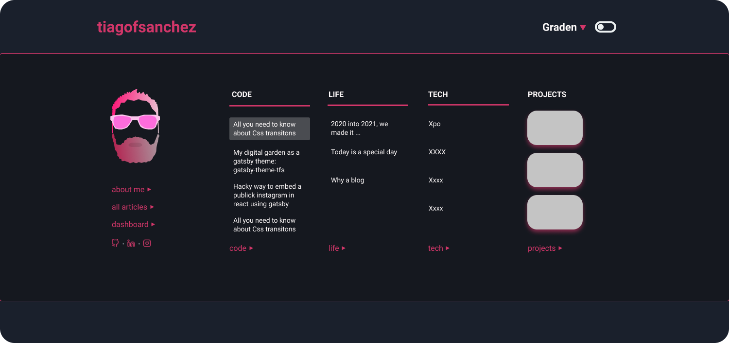
The idea is simple, I want to have a static header so that I can have my name always visible and I also want to have to have the night and day toggle always available for the user. At the end of the end, I am also expecting to create and about page and that, together with the categories of the blog posts will be staying on the NavBar that I want to build.
Adding navMenu as header of the blog
Let's get started then. First things first, I knew that I needed to change my layout.js component and, obviously create a new component, that in my case I called navMenu.js.
import React from "react";import { css, Styled } from "theme-ui";import Header from "./header";import NavMenu from "./navMenu";export default ({ children, ...props }) => { return ( <Styled.root css={css({ zIndex: `100`, opacity: `1` })}> <NavMenu {...props} /> <Header {...props} /> <div> <div css={css({ maxWidth: `container`, mx: `auto`, px: 3 })} > {children} </div> </div> </Styled.root> );};Above you can see I have added <NavMenu /> into my layout.js component, so let's have a look at that to better understand the changes made to that component. Before we check that though, just remember that I wanted to have the toggle in there, so to implement that quickly I just copied the header.js component that is sitting on my /node_modules/gatsby-theme-blog/src/components.
So far, easy. Now let's go to the more challenging piece.
Building navMenu component
Bellow, and to simplify, I will only share the return of the component as this will be the biggest difference from the header.js component, so here it goes
import React from "react";import { css, useColorMode, Styled } from "theme-ui";/*We are missing a couple of const: - image- Title- checkedIcon- uncheckedIcon*/export default ({ children, title, ...props }) => { const [colorMode, setColorMode] = useColorMode(); const isDark = colorMode === `dark`; const toggleColorMode = e => { setColorMode(isDark ? `light` : `dark`); }; /* Hate this implementation, but this was the only way I have found to inject the proper style here NOTE: Now I know that I can change this with <Styled /> and passing css={css({background:`primary`})} */ let backgroundColor = null; if (isDark) { backgroundColor = `#282c35`; } else { backgroundColor = "#eee"; } return ( <nav css={css({ position: `fixed`, width: `100%`, top: 0, left: 0, zIndex: "1000", height: `60px`, boxShadow: `1px 2px 10px rgba(0, 0, 0, 0.4)`, background: backgroundColor })} > <div css={css({ maxWidth: `container`, mx: `auto`, marginTop: "17px", px: 2 })} > <div css={css({ display: `flex`, justifyContent: `space-between`, alignItems: `baseline` })} > <div css={css({ display: `flex` })}> <Title {...props}>{title}</Title> </div> {children} <Switch aria-label="Toggle dark mode" css={css({ bg: `black` })} checkedIcon={checkedIcon} uncheckedIcon={uncheckedIcon} checked={isDark} onChange={toggleColorMode} /> </div> </div> </nav> );};A bit to big to digest, but really the only thing that you need to bear in mind is the introduction of the <nav /> tag, to the header.js component, and the way I had to style it so that it stays in the right place, at the very top of our blog. In this case, as you can see, I am styling <nav /> inline and using my theme-ui.
//the way I first implemented the dynamic stylinglet backgroundColor = null; if (isDark) { backgroundColor = `#282c35` } else { backgroundColor = '#eee' }<nav css={css({ position: `fixed`, width: `100%`, top: 0, left: 0, zIndex: "1000", height: `60px`, boxShadow: `1px 2px 10px rgba(0, 0, 0, 0.4)`, background: backgroundColor })} > {...whatever}</nav>Here, what is interesting to note as well was that, when I implemented this approach the first time I was not aware of the <Styled /> component and how that worked, so used a little bit of JS to make up for my lack of knowledge. After getting to understand how to use this new component, I refactored my navMenu.js component in the following way:
<nav> <Styled css={css({ position: `fixed`, width: `100%`, top: 0, left: 0, zIndex: "1000", height: `60px`, boxShadow: `1px 2px 10px rgba(0, 0, 0, 0.4)`, backgroundColor: `background` })}> {...whatever} </Styled></nav>Now I have one less constant and I am dynamically taking care of the style on a global basis on my colors.js files. That makes it easier to manage and a lot more scalable.
I was not particular happy with the implementation of the navMenu.js component together with the old avatar, so I had to change that a little bit.
A better me on the avatar
To make that change, I need to change the header.js component as well as to create a headerBio.js to accommodate for a nicer avatar on my "main blog" page. Basically I didn't want the same styling used on the avatar at the end of each post and was looking for something a little bit bigger and with a central position on the page.
On the header.js component I will get rid of the switch.js component as it was previously there and will make sure that the newly created component headerBio.js will be properly aligned. I am not going to put the code here, but fell free to check my blog repo.
On the headerBio.js I only made sure that my avatar photo would be bigger.
That is it for this post! See you around.
More posts about Code

Deploying Keystone-6 with Render
1 minutes read

Paginating through cards in NextJS not changing the url
1 minutes read
Thinking how to fetch data in nextjs
3 minutes read

Learning Advanced React with Wesbos
4 minutes read
Designing and implementing a megamenu in my digital garden
3 minutes read

All you need to know about CSS transitions
2 minutes read
Subscribe
No spam! Only good stuff!